
Machine embroidery is like a magic trick for fabrics. With the help of specialized machines, beautiful and intricate designs can be stitched onto various materials, adding a touch of personality and flair to any project.
But behind the magic lies a secret ingredient: color. Color theory plays a vital role in creating eye-catching and visually appealing embroidery designs.
So, if you’re ready to dive into the colorful theory of machine embroidery, let’s unveil the secrets of it!
Machine Embroidery Color Theory: Unveiling The Secrets
Importance of Color in Embroidery Designs
Color is to embroidery what seasoning is to food – it brings everything to life! The choice of colors can affect the mood, style, and overall impact of an embroidery design.
Whether you’re stitching a delicate floral pattern or a bold geometric shape, selecting the right colors can make all the difference.
Understanding the basics of machine embroidery color theory will help you create harmonious and visually pleasing combinations that will make your embroidery designs shine.
Understanding the Basics of Color Theory
Now, talks about the basics, like the color wheel which is a tool that shows the relationship between colors. It helps us see which colors are close to each other, which are opposite, and how they can be combined for different effects.
Primary, Secondary, and Tertiary Colors
Think back to your elementary school days when you learned about the embroidery color wheel. Remember those primary colors – red, blue, and yellow?
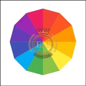
Well, they’re the building blocks of all colors! By mixing primary colors together, you can create secondary colors like purple, green, and orange.
And if you mix a primary color with a secondary color next to it on the wheel, you get fabulous tertiary colors! Understanding this color hierarchy will give you a solid foundation in color theory.
Color Wheel and Color Relationships
Now that we’ve refreshed our memories about primary, secondary, and tertiary colors, it’s time to explore how they interact with each other. The color wheel in machine embroidery is a handy tool that shows the relationships between colors.
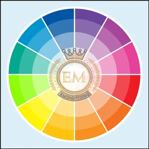
Adjacent colors on the wheel create harmonious schemes, while contrast and complementary colors (opposites on the wheel) provide striking contrasts. By understanding these relationships, you can achieve balance and harmony in your embroidery designs.
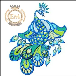
Selecting and Combining Colors for Machine Embroidery
By understanding which colors work well together, you can create beautiful, eye-catching embroidery that stands out.
Color Considerations for Different Fabrics
Not all fabrics are created equal when it comes to color. Some fabrics may absorb color differently, while others may have a sheen that affects how colors appear.
When selecting colors for your embroidery designs, it’s essential to consider the fabric you’ll be working with to ensure the colors come out as intended.
A color that looks vibrant on one fabric may appear dull on another, so test out different combinations to find the perfect match.
Creating Color Palettes for Embroidery Projects
Creating an embroidery color palette is like curating a playlist for your embroidery design. A well-thought-out palette sets the mood and theme, whether you’re going for a vintage vibe or a modern pop of color.
Consider the emotions you want to evoke and look for inspiration in nature, art, or even your favorite outfit. Experiment with different color combinations until you find the perfect mix that makes your embroidery project sing.
Thread Color Blending Techniques
Just like master chefs create new flavors by combining ingredients, embroiderers can create unique colors by mixing thread. Don’t limit yourself to using only pre-made harmonizing thread colors – unleash your creativity!
Experiment with blending threads to achieve custom shades that add depth and dimension to your designs.
This mixing technique allows you to take your color choices to a whole new level and truly make your embroidery designs one-of-a-kind.
Exploring Color Schemes and Harmonies in Embroidery Designs
Diving into color schemes and harmonies in embroidery designs is like exploring a rainbow of possibilities that can make your embroidery projects pop.
Monochromatic Embroidery Designs
Sometimes less is more, and that’s where monochromatic embroidery designs shine. By using shades and tints of a single color, you can create a sophisticated and elegant look.
Monochromatic designs are perfect for adding subtle texture and detail without overwhelming the eye, making them great options for both bold and delicate embroidery projects.
Analogous Color Schemes in Embroidery
Analogous color schemes are like best buddies on the color wheel. These schemes use colors that are next to each other, creating a harmonious and cohesive look. Embroidery designs using analogous colors evoke a sense of unity and balance.
So, if you want your embroidery to feel calm and soothing or to have a naturally pleasing aesthetic, consider using analogous color schemes.
Complementary Color Harmonies and Contrasts
Opposites attract, and the same goes for colors. Complementary colors, which sit on opposite sides of the color wheel, create striking contrasts when used together.
Embroidery designs using complementary color schemes command attention and create a bold and energetic impact.
So, if you’re after designs that pop and make a statement, experiment with complementary colors to create eye-catching embroidery projects.
Tips and Techniques for Creating Depth and Dimension with Colors
When we talk about adding depth and dimension with colors, it’s like giving your artwork or design a 3D effect using clever color tricks.
Using Shades and Tints to Add Depth
Want your embroidery to have a three-dimensional look? Experiment with shades and tints of the same color. By varying the darkness or lightness of a specific hue, you can create depth and bring your design to life.
For example, using a darker shade of blue for the background and a lighter tint for the foreground elements can make them pop and appear closer to the viewer.
Play around with different combinations to achieve the desired effect and make your embroidery visually captivating.
Creating Textures and Patterns with Color Variations
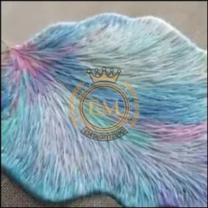
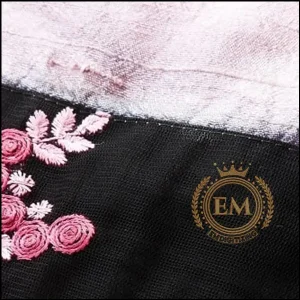
Colors can also be used to create texture and patterns in your embroidery designs. By strategically incorporating different shades and complementary colors, you can mimic the appearance of various textures, such as wood grain or fur.
Experiment with different stitching techniques, like blending colors or using variegated threads, to add depth and dimension to your embroidery. Let your creativity run wild and explore the endless possibilities that color variations offer.
Troubleshooting Color Issues in Machine Embroidery
Imagine you’re working on a beautiful embroidery project, but the colors look off—they might bleed, not match your design, or not look as vibrant on the fabric as they did in your plan.
This section is like a handy guide to help you identify what went wrong and how to fix it.
Color Bleeding and Fading Prevention
Nothing is more frustrating than spending hours on an embroidery project, only to have the colors bleed or fade over time. To prevent color mishaps, it’s essential to use high-quality threads and fabrics that are colorfast.
Additionally, pre-washing your fabrics before stitching can help remove any excess dyes that may cause bleeding. If you’re in doubt about the colorfastness of a particular thread, it’s wise to test it on a small area before committing to the full embroidery. Better safe than sorry!
Embroidery Thread Color Selection
Color matching can be a tricky endeavor, especially when trying to replicate a specific shade or when working with different types of threads. To tackle this challenge, invest in embroidery color palettes or a set of thread swatches for reference.
These tools can help you choose the closest matching thread color for your project. Additionally, adjusting the tension and stitch density on your embroidery machine can also affect how colors appear. Don’t be afraid to experiment and make adjustments until you achieve the desired color match.
Final Thoughts on Machine Embroidery Color Theory
In the colorful world of machine embroidery, understanding color theory is a powerful tool. By tapping into the emotional impact and symbolism of colors, you can elevate your embroidery projects to new heights.
Experiment with shades, tints, and color variations to create depth, texture, and visual interest in your designs. Remember to troubleshoot potential color issues, such as bleeding or matching challenges, to ensure the longevity and accuracy of your creations.
So, grab your threads, embrace the artistry of color, and let your machine embroidery shine!
EMdigitizing: Embroidery Digitizing Expert At Your Service
Looking for assistance in transforming your designs into beautiful embroidery?
Discover EMdigitizing, your go-to expert for embroidery digitizing services. We’re excited to offer an incredible 50% discount for all first-time customers on our wide range of services.
Our skilled team excels in digitizing designs with precision, ensuring your project is prepared swiftly and affordably.
Have questions? Reach out to us!
Our friendly support team is ready to assist and will respond promptly. If you find this information useful, please share it with your friends.
Thank you for considering us, and we wish you a delightful embroidery experience!
Frequently Asked Questions:
- Color Wheel Theory: Involves understanding the color wheel and color relationships (complementary, analogous, etc.).
- Color Harmony Theory: Focuses on creating aesthetically pleasing color combinations.
- Color Context Theory: How color behaves in relation to other colors and shapes.
Choose colors based on the desired mood, theme, and contrast. Consider the fabric color and how different thread colors will interact with it.
Color in embroidery is crucial for creating visual appeal, conveying emotions, and enhancing the design’s overall impact.
Color theory is a set of guidelines for combining colors in a way that is harmonious and pleasing to the eye.
This theory, often found in art and design, typically refers to five main color groups: red, yellow, blue (primary colors), and green and purple (secondary colors).
Color theory is important as it helps in understanding and utilizing colors effectively to create visually appealing and coherent designs.