
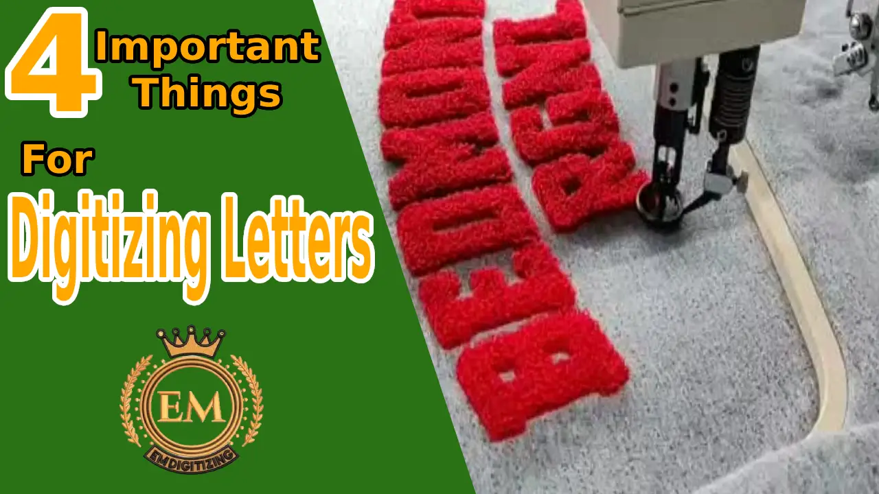
Here are the following four factors you should consider that assist you in making your letter digitization process relatively smooth and grabs the attention of your target audience.
- Consider the size, width, and height of letters
- Avoid using curved, twisted, or fancy words
- Appropriate density
- Underlay properly
Now we will give you one by one illustration of each step in detail.
1. Size, Width, Height
When digitizing letters, size matters. It is always recommended that your letter size should not be smaller than a quarter inch. Along with size, the width of the column stitches is also important.
There are a few points that you need to keep in mind for making your letters unique and readable by your audience.
Width of Letters
Let’s consider, the diameter of your needle is 1 nm, which would be the minimum width for a satin stitch.
Width spacing between letters intends to be 0.8-1mm.
Size of Needle and Thread
The size of the needle used should be small for digitizing small letter words with lean thread. You are not able to create a satin stitch that is narrower than the needle used to create that stich to avoid any accord on quality. You are advised to use a 40-weight thread with a 75/11 needle for digitizing small letter projects. You can change that criteria to a 70/10 needle with 60weight thread(25% less thick as compared to thread 40) by using advanced feature technologies depending upon the complexity of your project.
Height of Letters
For some projects, you may undervalue the width, then the height is a prime factor to analyze. For example, if you apply a technical rule as a thumb rule, as you are going to digitize letters that may contain one or more alphabet, then the height of capital letters should be 4mm.
In case of more than one alphabet, each letter should be 5mm in height.
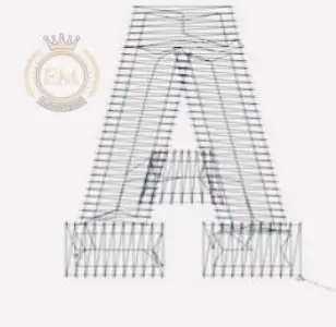
2. Avoid Using Curved /Twisted/Serif Letters
It is difficult to deal with letters having variable-width columns. It might be risky for you to maintain the gleam while digitizing serif or small letters. Serif is basically a line on the upper or lower ends of strokes of letters. Especially when you need to digitize on a narrower space, it looks messy and you may lose quality. Always prioritize simplified words over those letters having curved edges for digitization.
There are many free fonts available, you can choose according to your project. Because your preference is linked to the time you invest in this project and it will decide whether to enhance or lower the quality of your work.
3. Appropriate Density of Stitch and Fabric
“Spacing between stitches refers to density in terms of embroidery.”
For example, the higher the density, the more stitches are together. You need to be more careful when you try to compress too many stitches over a small surface. Both extremely high and low density can be problematic.
E.g, thread breaks, puckering, holes in fabrics, poor quality designs, and many more.
Another important factor is considering that the stitch density must be similar to that of fabric density used for digitizing. High-density stitch on lightweight fabric results in snaggy edges of the digitizing letters.
Certain alphabet has closed hoops such as o, p, q, etc. These alphabets require low-density stitches in order to digitize in a good manner. The standard criteria of radius for the closed looped space are 0.45mm.
So it’s very important to diagnose the density issues. Density should be set appropriately according to design when digitizing letters.
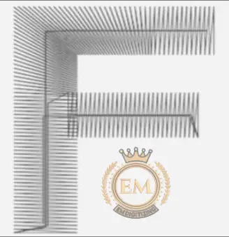
4. Proper Underlay
Underlay provides a base for the letters to digitize properly and a foundation for cover stitches. In embroidery, its functions are similar to the skeleton system of humans. Underlay provides a loft that raises the cover stitch when dealing with soft fabric. The most familiar types of underlay are:
- Edge Run underlay(run along the edge of a letter)
- Center Run underlay( go down through the column)
 Edge run underlay is not supposed to support the digitizing of small letters. Sometimes you use the stitches that move on fabric for the lettering also serves the function of underlay. This is important to know whether to use the right underlay. It will only be possible when you got enough experience with the passage of time. For example, by applying the thumb rule:
- Letters with heights under 5mm should not have underlay.
- Center run underlay is applied on letters with height ranges between 6-10mm.
- Letters with a height of more than 10mm also are enough for applying edge run underlay.
So these are a couple of points you should consider when digitizing letters in order to avoid any hurdle in the smooth process of digitizing. Then you will leave a powerful impression on your audience due to high-quality work.
Conclusion
Digitizing letters is not an easy task. Very little negligence can make a big difference. For making your letters looks unique avoid using wavy or twisted letters in your embroidery that will be difficult to read by your audience. Letters are hard to digitize on fabrics such as jackets etc. It requires different changes of density and underlay as compared to the soft fabric. Only experts know the right use of these key factors for producing high-quality letters. Hopefully, this article helps you to figure out the best way when you are going to perform lettering.