
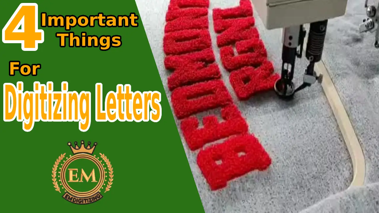
Voici les quatre facteurs suivants que vous devriez prendre en compte et qui vous aideront à rendre votre processus de numérisation de lettres relativement fluide et à attirer l'attention de votre public cible..
- Considérez la taille, largeur, et hauteur des lettres
- Évitez d'utiliser des courbes, tordu, ou des mots fantaisistes
- Densité appropriée
- Sous-coucher correctement
Nous allons maintenant vous donner une illustration détaillée de chaque étape..
1. Taille, Largeur, Hauteur
Quand numérisation des lettres, questions de taille. Il est toujours recommandé que la taille de votre lettre ne soit pas inférieure à un quart de pouce.. Avec la taille, la largeur des points de colonne est également importante.
Il y a quelques points que vous devez garder à l’esprit pour rendre vos lettres uniques et lisibles par votre public..
Largeur des lettres
Let’;considérons, le diamètre de votre aiguille est 1 nm, quelle serait la largeur minimale pour un point plumetis.
L'espacement en largeur entre les lettres doit être compris entre 0,8 et 1 mm..
Taille de l'aiguille et du fil
La taille du aiguille utilisé doit être petit pour numériser des mots en minuscules avec du maigre fil. Vous n'êtes pas en mesure de créer un point satin plus étroit que l'aiguille utilisée pour créer ce point afin d'éviter tout accord sur la qualité.. Il est conseillé d'utiliser un fil de poids 40 avec un 75/11 aiguille pour numérisation projets de lettres minuscules. Vous pouvez modifier ce critère en un 70/10 aiguille avec fil de calibre 60(25% moins épais que le fil 40) en utilisant des technologies de fonctionnalités avancées en fonction de la complexité de votre projet.
Hauteur des lettres
Pour certains projets, vous pouvez sous-évaluer la largeur, alors la hauteur est un facteur primordial à analyser. Par exemple, si vous appliquez une règle technique comme règle empirique, comme tu vas le faire numériser lettres pouvant contenir un ou plusieurs alphabets, alors la hauteur des lettres majuscules doit être de 4 mm.
En cas de plusieurs alphabets, chaque lettre doit mesurer 5 mm de hauteur.
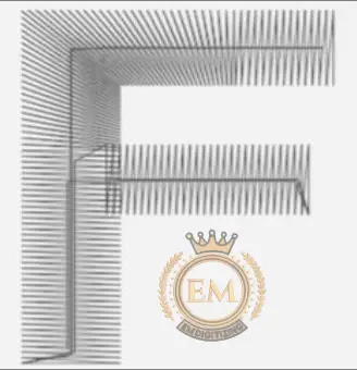
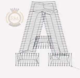
2. Évitez d'utiliser des lettres courbées/torsadées/Serif
Il est difficile de gérer des lettres ayant des colonnes de largeur variable. Il pourrait être risqué pour vous de maintenir la lueur pendant numérisation serif ou minuscules. Serif est essentiellement une ligne située aux extrémités supérieure ou inférieure des traits de lettres.. Surtout lorsque vous devez numériser sur un espace plus étroit, ça a l'air compliqué et vous risquez de perdre en qualité. Donnez toujours la priorité aux mots simplifiés plutôt qu'aux lettres aux bords incurvés pour la numérisation..
Il existe de nombreuses polices gratuites disponibles, vous pouvez choisir en fonction de votre projet. Parce que votre préférence est liée au temps que vous investissez dans ce projet et elle décidera si vous souhaitez améliorer ou diminuer la qualité de votre travail..
3. Densité appropriée du point et du tissu
"L’espacement entre les points fait référence à la densité en termes de broderie.
Par exemple, plus la densité est élevée, plus il y a de mailles ensemble. Vous devez être plus prudent lorsque vous essayez de comprimer trop de points sur une petite surface.. Les densités extrêmement élevées et faibles peuvent être problématiques.
Par exemple, ruptures de fil, plissement, des trous dans tissus, mauvaise qualité dessins, et beaucoup plus.
Un autre facteur important est de considérer que la densité des points doit être similaire à celle du tissu utilisé pour la numérisation.. Couture haute densité sur tissu léger en tissu entraîne des bords accrocheurs des lettres à numériser.
Certains alphabets ont des cerceaux fermés comme o, p, q, etc. Ces alphabets nécessitent des points de faible densité afin d'être correctement numérisés.. Les critères standard de rayon pour l'espace en boucle fermée sont de 0,45 mm..
Il est donc très important de diagnostiquer les problèmes de densité. La densité doit être réglée de manière appropriée en fonction motif quand numérisation des lettres.
4. Sous-couche appropriée
La sous-couche fournit une base pour les lettres à numériser correctement et une base pour les points de couverture. En broderie, ses fonctions sont similaires au système squelettique des humains. La sous-couche fournit un loft qui soulève le point de recouvrement lorsqu'il s'agit de tissu doux. Les types de sous-couches les plus connus sont:
- Sous-couche Edge Run(courir le long du bord d'une lettre)
- Sous-couche centrale( descendre à travers la colonne)
 La sous-couche Edge Run n'est pas censée prendre en charge le numérisation de petites lettres. Parfois, vous utilisez les points qui se déplacent sur le tissu car le lettrage sert également de sous-couche.. Il est important de savoir s’il faut utiliser la bonne sous-couche. Cela ne sera possible que lorsque vous aurez acquis suffisamment d'expérience au fil du temps.. Par exemple, en appliquant la règle empirique:
- Les lettres d'une hauteur inférieure à 5 mm ne doivent pas avoir de sous-couche..
- La sous-couche centrale est appliquée sur les lettres dont la hauteur varie entre 6 et 10 mm..
- Les lettres d'une hauteur supérieure à 10 mm suffisent également pour appliquer une sous-couche de chant..
Voici donc quelques points que vous devriez considérer lorsque numérisation lettres afin d'éviter tout obstacle au bon déroulement du processus de numérisation. Vous laisserez alors une forte impression sur votre public grâce à un travail de haute qualité.
Conclusion
Numérisation les lettres ne sont pas une tâche facile. Une très petite négligence peut faire une grande différence. Pour rendre vos lettres uniques, évitez d'utiliser des lettres ondulées ou tordues dans votre broderie qui seront difficiles à lire par votre public.. Les lettres sont difficiles à numériser sur tissus comme des vestes, etc.. Il nécessite différents changements de densité et de sous-couche par rapport au soft en tissu. Seuls les experts savent utiliser correctement ces facteurs clés pour produire des lettres de haute qualité.. Avec un peu de chance, cet article vous aide à déterminer la meilleure façon d'effectuer le lettrage.