Color theory is super important for anyone who wants to make cool machine embroidery. When you understand color theory, you can pick colors that look great together and make your designs pop!
This guide will help you learn the basics of color theory, like how colors mix, how to blend them, and what feelings different colors can create.
Knowing about color will help you choose the best colors for your projects, so they look awesome! Whether you’re just starting or want to get better, learning these color ideas will make your embroidery more fun and help you create amazing designs!
Learn Color Theory in Machine Embroidery for Better Designs
Key Color Concepts for Embroiderers
Understanding color theory is essential for creating beautiful embroidery designs. Here are some important concepts explained in simple terms:
- Hue: The specific name of a color, such as red, blue, or green, indicating its position on the color wheel.
- Tone: This is created by mixing gray with a color, which softens its brightness and intensity.
- Shade: A shade occurs when black is added to a color, resulting in a darker version. For instance, mixing black with red produces dark red.
- Tint: A tint is formed by adding white to a color, making it lighter. An example of this is pink, which is a tint of red.
- Saturation: This term describes how bright or vivid a color is. Highly saturated colors appear bright, while less saturated colors look faded.
- Primary Colors: The three main colors—red, blue, and yellow—that cannot be made by mixing other colors.
- Secondary Colors: These colors result from mixing two primary colors. For example, combining red and blue creates purple.
- Tertiary Colors: These are formed by mixing a primary color with a secondary color. An example is mixing blue and green to get blue-green.
- Pantone Color Chart: A standardized color guide widely used in industries like embroidery, ensuring consistent color use across various projects.
The Color Wheel in Machine Embroidery
The embroidery color wheel is a powerful tool for anyone involved in machine embroidery. It helps you understand how colors work together, making it easier to create beautiful designs.
Here’s how you can use the color wheel in your projects:
Primary, Secondary, and Tertiary Colors
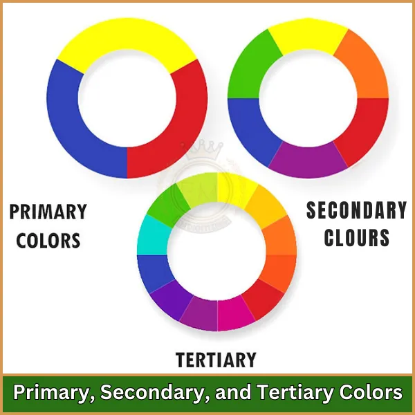
- The color wheel starts with three primary colors: red, blue, and yellow. These colors cannot be created by mixing others.
- When you mix two primary colors, you get secondary colors. For example, red and blue mix to make purple, while blue and yellow mix to create green.
- Tertiary colors are made by mixing a primary color with a secondary color. An example is blue-green, which comes from mixing blue and green. Knowing these relationships helps in choosing your embroidery color palettes.
Complementary Colors
Complementary colors are those that sit opposite each other on the color wheel, such as red and green or blue and orange. Using complementary colors in your designs creates a strong contrast, making your embroidery pop and draw attention.
Triadic Colors
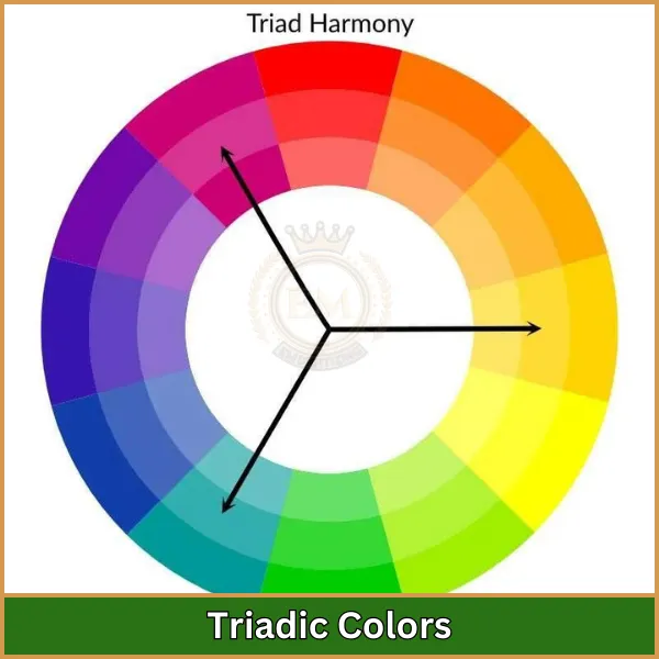
Triadic colors are evenly spaced around the color wheel, such as red, yellow, and blue.
This combination provides a vibrant and balanced color scheme, ideal for lively and dynamic designs.
Analogous Colors
Analogous colors are next to each other on the color wheel, like blue, blue-green, and green. These colors create a harmonious look, often found in nature, and are great for making your designs feel more cohesive and soothing. This approach is essential in machine stitching and color harmony.
Value and Saturation in Embroidery
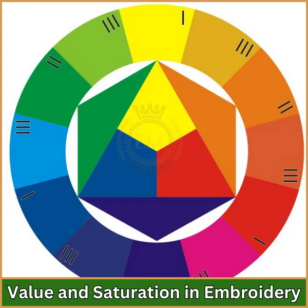
Value refers to how light or dark a color is, while saturation indicates how bright or vivid the color appears. By adjusting the value and saturation of your thread colors, you can add depth and dimension to your embroidery, enhancing the overall impact of your design.
Contrast and Value in Design
Machine embroidery color theory is essential for understanding how to create eye-catching designs. In embroidery, understanding contrast and value is crucial for making your projects stand out and look more professional.
What is Contrast?
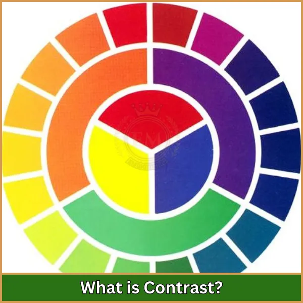
It refers to the difference between two colors or elements in your design. It helps highlight certain parts and draw the viewer’s attention. Here are some ways to use contrast effectively:
- High Contrast: Using colors that are very different from each other, like black and white or red and green, creates a striking look. This is great for making specific details pop, especially when considering the contrast and complementary colors.
- Low Contrast: When you use colors that are similar, like two shades of blue, the design appears softer and more blended. This can create a calm and harmonious effect.
What is Value?
It refers to how light or dark a color is. Adjusting the value in your embroidery can add depth and dimension. Here’s how you can use value in your designs:
- Light Values: Colors that are lighter, like pale yellow or light pink, create a feeling of openness. They can make your design look airy and bright.
- Dark Values: Darker colors, like navy blue or dark green, add weight and depth. They can create a more dramatic look in your embroidery.
Using Contrast and Value Together
Combining contrast and value can make your embroidery designs more interesting. For example, using a dark thread on a light fabric creates high contrast, making the design stand out. On the other hand, using threads of similar values can create a smoother, more integrated look.
Psychological Impact of Colors
Color theory is crucial for understanding how colors influence our emotions and perceptions. When creating machine embroidery designs, recognizing how different colors can affect viewers’ feelings is essential. Here are some important factors to consider when choosing your color palette:
Warm vs. Cool Colors
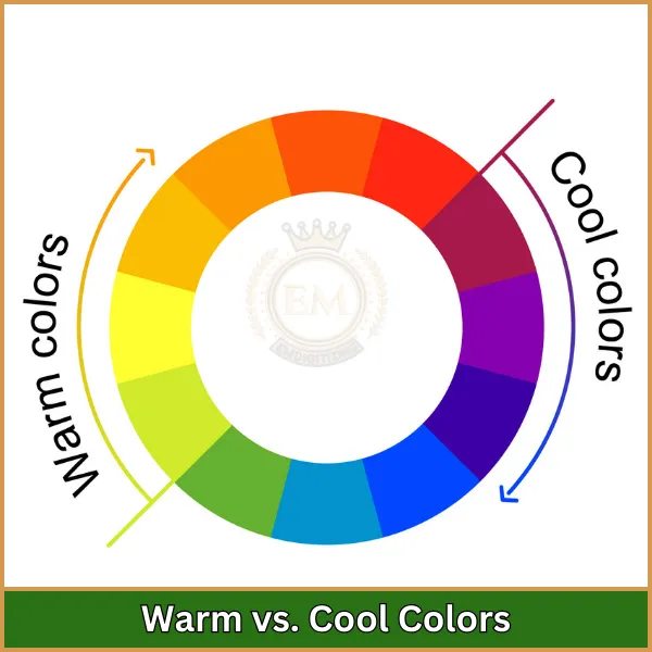
Warm colors, such as red, orange, and yellow, evoke feelings of energy and excitement. These colors can make your designs feel vibrant and engaging. For example:
- Red often represents love and passion, making it ideal for designs that aim to create strong emotional responses.
- Orange conveys warmth and friendliness, perfect for cheerful projects that invite positivity.
- Yellow brings brightness and joy, uplifting spirits and evoking a sense of happiness.
On the other hand, cool colors like blue, green, and purple create a calming and peaceful atmosphere. These shades can lend serenity to your designs:
- Blue is associated with tranquility and trust, making it a great choice for designs that need to promote reassurance.
- Green symbolizes nature and renewal, providing a refreshing and balanced feel that can help reduce stress.
- Purple is linked to creativity and luxury, adding elegance to your embroidery and inspiring imagination.
Bright vs. Muted Colors
Bright colors, such as neon pink or vivid orange, are eye-catching and energizing. They are perfect for lively designs that aim to attract attention. In contrast, muted colors like soft lavender or sage green offer a more understated and sophisticated appearance. These softer tones can create a calming effect and convey elegance, making them suitable for subtle designs.
Color Associations
Different colors carry specific meanings that can enhance the theme of your embroidery. For example:
- Red is often associated with strong feelings like love and power, making it impactful in design.
- Blue signifies trust and stability, making it ideal for professional designs that inspire confidence.
- Green represents growth and harmony, perfect for nature-themed projects that encourage relaxation.
By utilizing color psychology in embroidery, you can ensure that your designs effectively communicate the intended message and evoke the desired emotional responses.
Symbolism and Culture
Colors can have varying meanings in different cultures. For instance, while white often symbolizes purity in Western societies, it may represent mourning in some Eastern cultures. Understanding these cultural differences allows you to choose colors that resonate with your audience and convey the right message, ensuring your designs are both meaningful and appropriate.
Emotional Impact
Colors significantly impact our feelings. For instance, while blue can create a sense of calm, red may evoke excitement or even anger. Choosing colors that match the emotional tone of your design is crucial for leaving a lasting impression. By understanding these psychological effects, you can make more informed decisions in your embroidery thread color selection and effectively apply color theory to enhance your designs!
Techniques for Color Blending in Digitizing
Thread color blending techniques are crucial in embroidery digitizing, adding depth and dimension to designs. By combining different shades and hues, you can create smooth transitions between colors, giving your embroidery a more dynamic and lifelike appearance. Here are some effective techniques for color blending:
1. Gradient Blending
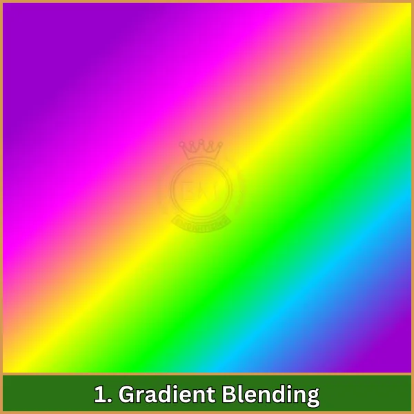
Gradient blending involves gradually transitioning from one color to another. This technique is particularly useful for creating natural effects, such as skies or landscapes. For example, you might blend from light blue at the top to darker blue at the bottom to mimic the depth of the sky.
2. Layered Blending
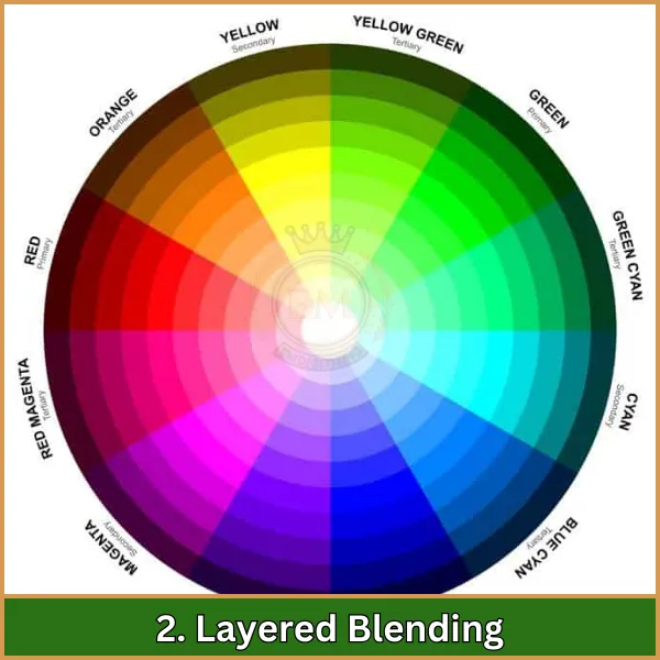
In layered blending, different colors are stitched over each other to produce a gradual blending effect.
This method is ideal for designs that require subtle color shifts, like floral patterns or animal fur.
By layering colors, you can create a rich texture and add complexity to your designs.
3. Cross-Stitch Blending
This technique involves using two different colors of thread in cross-stitching to create intricate blends. It’s especially effective for adding detail and texture to fine elements in your design, such as shading in flowers or fabric patterns. The cross-stitch method can make your embroidery look more textured and lively.
4. Shade Blending
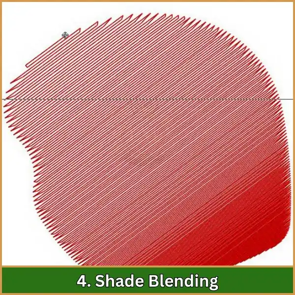
Shade blending focuses on the gradual transition between different values of the same color.
This technique is useful for creating depth in your designs, such as highlighting and shadowing.
For instance, moving from a dark green to a light green can help give the impression of depth in foliage.
5. Color Pulling
Color pulling is a technique where the embroidery machine slightly pulls the thread during stitching to create a blended look. This technique can soften the edges between two colors, providing a smooth transition that can enhance the overall appearance of the design.
6. Use of Variegated Thread
Variegated thread contains multiple colors in a single strand, allowing for automatic blending as you stitch. This technique is convenient and adds a unique touch to your designs, creating beautiful, blended effects without the need for manual color changes.
7. Adjusting Stitch Density
Changing the stitch density can influence how colors blend in your design. Higher density can result in a more pronounced color blend, while lower density can create a softer, more subtle effect. Adjusting stitch density allows for creative flexibility in achieving the desired look.
Conclusion
Learning about color theory in machine embroidery is a fun way to make your designs even better. When you know how colors work together and what feelings they can create, you can choose the best colors for your projects. This will help your embroidery look awesome!
If you need help with your embroidery, check out our services at EMdigitizing. We work fast, have good prices, and make sure your designs are really high quality.
And guess what? If you are a new customer, you get 50% off your first order! Let us help you make your embroidery ideas come true!
FAQs
The three basic color theories are color harmony, the color wheel, and color context. These theories help create logical and effective color structures in designs.
When choosing colors for embroidery, consider the fabric color, as it affects your color choices. You can use the color wheel to help select a color. Additionally, look around you for inspiration; you’ll find many great color combinations in nature and your environment. Trust your experience, as certain color combinations often come to mind when you think of designs.
Colors play a crucial role in adding depth and detail to embroidery designs. For 3D designs, the placement of colors is important. By combining light and dark colors, you can create dimension and depth, making your design more visually appealing.
Color theory is the study of how different color combinations look and how they affect people’s feelings and perceptions. It’s an important tool for designers, artists, and embroidery creators because it helps them choose the right colors for their projects.
Color theory is important because colors can have a strong impact on people’s emotions and decisions. According to color psychology, color combinations can influence our buying choices and evoke emotional reactions. Understanding this can help you create more effective and appealing designs.
